




 Contact Us

You’re getting ready for an event and stare at a closet full of outfits—how do you pick the right dupatta color without trial-and-error?
The easiest first rule: decide what you want the eye to notice. Is the outfit itself the star, or should the dupatta provide contrast, soft framing, or sparkle? This article focuses on the practical choices that actually change how an outfit reads—color harmony, contrast, fabric and occasion—so you can pick a dupatta color confidently every time.
What really matters when choosing a dupatta color
Before trying combinations, check three priorities that determine whether a color will succeed: the outfit’s dominant color and pattern, the occasion (formal vs casual), and the dupatta fabric’s visual weight. These factors shape whether a color complements, competes with, or overpowers the outfit.
Dominant color and pattern — go with hierarchy, not equality
If the kurta or lehenga has a dominant color, the safest options are a matching tone, a neutral, or a deliberate contrasting color that follows basic color theory (complementary or triadic). When the outfit is patterned, choose a dupatta color drawn from one of the pattern’s smaller motifs to unify the look. If the outfit already has heavy embellishment, prefer subtler dupatta colors and finishes.
Occasion and formality — match intensity
Work or daytime casual: muted, neutral, or single-tone dupattas (beige, slate, dusty pastels). Festive or wedding: richer, deeper or brighter tones with metallic threads, or a bold contrast if the outfit itself is simple. For nikah or formal ceremonies, coordinated tones with refined borders read elegant; for baraat or sangeet, you can choose saturated contrasts.
Fabric and sheen change how color reads
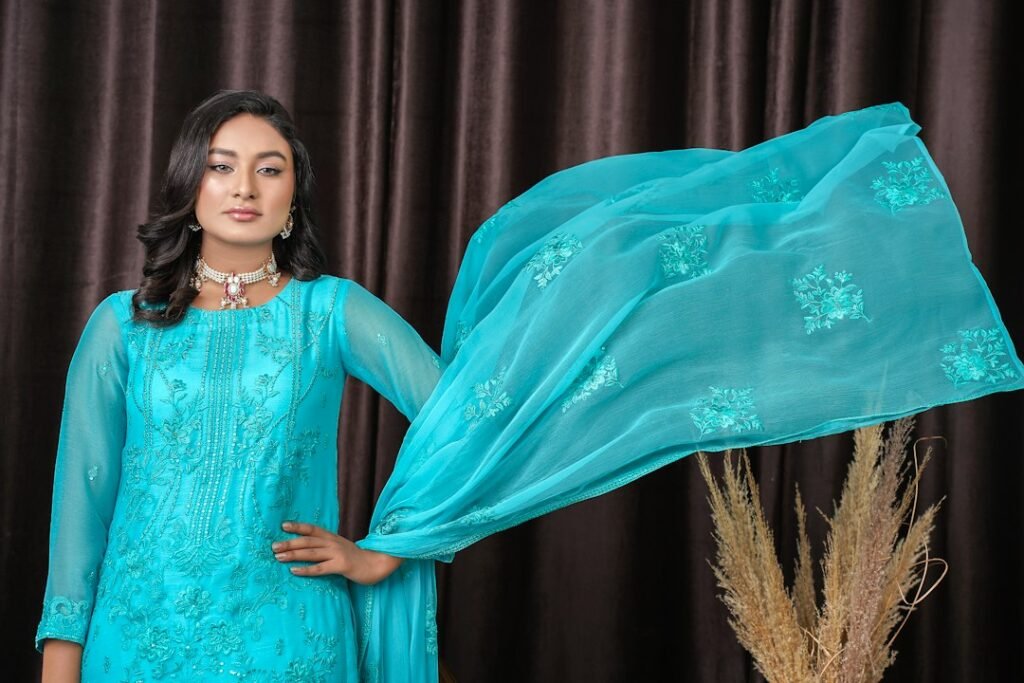
Silk, chiffon and brocade reflect light—colors appear richer. Cotton and linen absorb light—colors look softer and more muted. A mustard silk dupatta will read much brighter than a mustard cotton one. Factor fabric when choosing matching shades: a satin dupatta in a “muted” hue may still appear highly luminous in photos.
Practical selection by use case (pick the section that matches your need)
1. Everyday or office: low-contrast, fuss-free choices
Choose neutral or tonal dupattas that won’t distract from your outfit or workplace. Toned-down versions of the outfit color (one or two shades lighter/darker) look composed. Neutrals like beige, charcoal, navy or olive are versatile. If your outfit is patterned, pick a dupatta in an understated single color pulled from the pattern.
2. Casual outings: relaxed but deliberate contrasts
For a brunch or day out, a contrasting dupatta can add personality. Use the color wheel: pair teal with coral, mustard with indigo, or maroon with dusty pink. Keep the fabric light (cotton voile, lawn) so contrast feels effortless. For printed kurtas, choose a solid dupatta to avoid visual clutter.
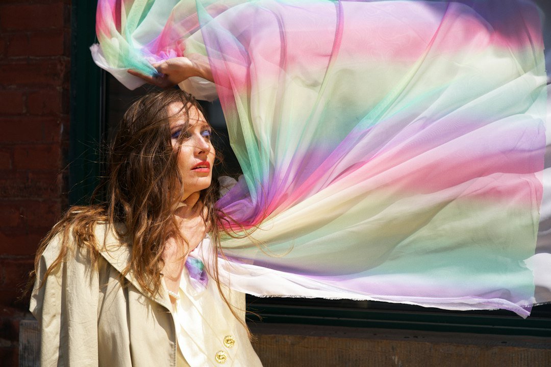
3. Festive or wedding guest: richer colors and subtle drama
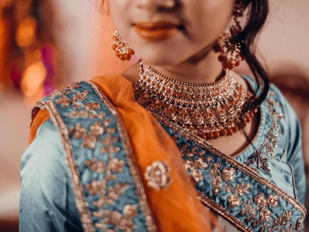
Let the occasion justify saturated colors and metallic accents. If your outfit is a neutral or pastel, a jewel-toned dupatta (emerald, ruby, deep sapphire) instantly ups the drama. If your outfit is heavily embellished, prefer a dupatta in a coordinating shade with a simple border to avoid competition. Metallic thread or a zari border can anchor the dupatta visually—match the metal tone to your jewelry.
4. Bridal or formal ceremony: cohesion and focal balance
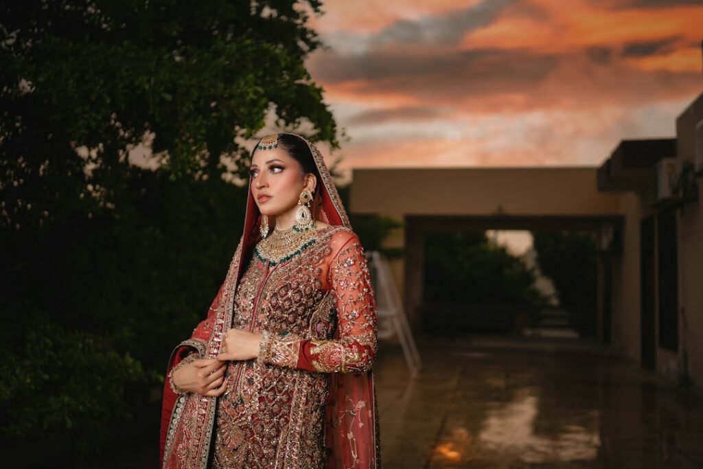
Bridal dupattas are typically statement pieces—choose a color that either matches the main outfit exactly for a unified look, or intentionally contrasts to create focal depth (for example, a deep red dupatta with an ivory heavily embroidered dress). For multi-piece bridal looks, keep one element dominant: either the outfit’s embroidery or the dupatta’s color/embellishment should be the main visual focus, not both.
Color strategies that consistently work
- Monotone/tonal: One hue in different shades (safe and elegant).
- Match a trim or motif: Pull the dupatta color from embroidery or printed motifs for cohesion.
- Neutral frame: A neutral dupatta (cream, grey, black, navy) frames vivid outfits and photographs well.
- Bold contrast: Use complementary colors for energy—use sparingly with heavy patterns.
- Metallic coordination: Match gold or silver borders to your jewelry tone to feel purposeful.
Color mistakes to avoid
Avoid pairing two equally dominant saturated colors unless they are intentionally color-blocked with clean lines. Don’t match a dupatta too literally to photographed fabric—view colors in natural light. Steer clear of very similar shades in different fabrics (e.g., matte kurta vs. shiny dupatta) unless you want visible texture contrast; sometimes that contrast looks mismatched rather than layered.
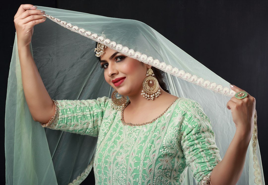
One product that helps fasten and finish the look
If your dupatta color choice is settled but you need a tidy, secure drape—especially for formal events—a decorative pin or brooch completes the look and prevents slipping. For a universally flattering, elegant finish, a gold-toned crystal brooch works with many dupatta colors and textures.
Quick decision flow to pick a color in under five minutes
- Identify the outfit’s dominant color and fabric sheen.
- Decide the role of the dupatta (blend, frame, or contrast).
- Choose a color: pick from the outfit’s palette for unity, a neutral for frame, or a complementary jewel for contrast.
- Check in natural light and adjust shade by ±1–2 tones to match fabric sheen.
- Add a border or pin that ties to your jewelry metal.
When to break the rules
Fashionable exceptions are purposeful: color-blocking with three bold colors can look modern if lines are clean; mixing printed dupattas with printed kurtas can work when one print is very small-scale and the other large-scale. Trust the overall balance—if the eye has a single resting point, the mix is usually successful.
- Have I identified the outfit’s dominant color and any small motif colors?
- Is the occasion casual, formal, or celebratory—does the dupatta’s color match that tone?
- Does the fabric sheen of dupatta and outfit read well together in natural light?
- Does the dupatta add a clear visual role (unify, frame, contrast) rather than compete?
- Have I matched border metal to my jewelry tone or chosen a neutral pin?
Choose a dupatta color by answering three quick questions: what is the outfit’s dominant color, what role should the dupatta play, and what fabric sheen will change how the color reads. Prioritize visual hierarchy—unity, subtle framing or intentional contrast—and use borders or a brooch to tie the look together.
Can I wear a printed dupatta with a printed outfit?
Yes, if one print is markedly smaller or more muted than the other, or if the colors are limited to the same palette. Otherwise choose a solid to avoid visual clutter.
Should my dupatta match my jewelry or the outfit?
Match metal-tone details (gold/silver) to jewelry; match color to the outfit for unity or choose a deliberate contrast color for emphasis.
How do I pick a dupatta for photos?
Fabrics with some sheen photograph better—silk or chiffon in jewel tones add depth; avoid highly reflective sequined dupattas that create hotspots unless it’s the intended feature.
Is a neutral dupatta always safe?
Neutral dupattas are versatile and safe for most occasions, but they can look flat with very understated outfits—use texture or a subtle border to add interest.
What if I only have one dupatta and many outfits?
Choose a high-quality neutral in a flattering fabric (e.g., ivory silk or deep navy chiffon) that pairs well across tones; use pins or brooches to change styling.